June 1, 2023
YouTube Music:
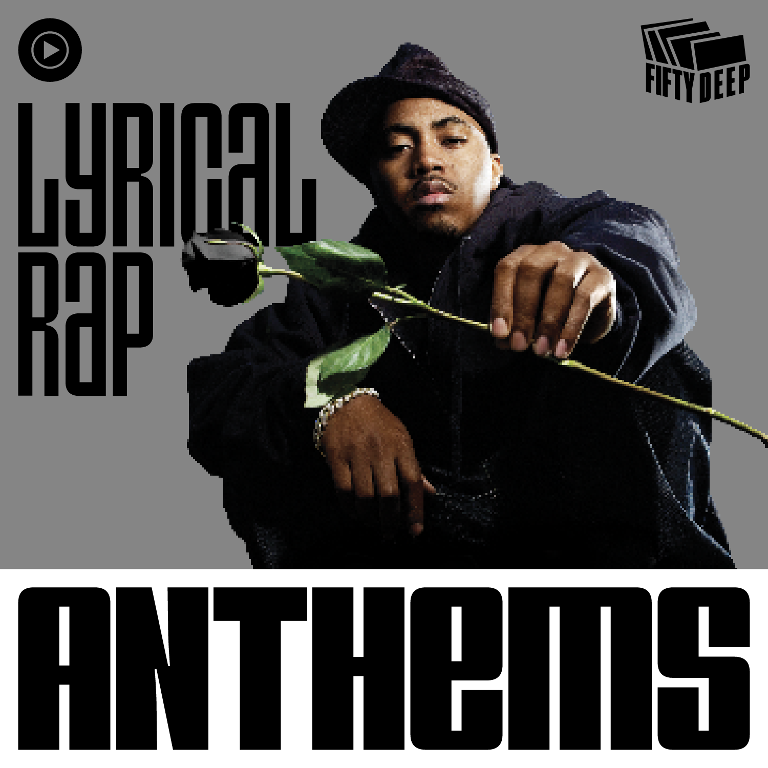
Fifty Deep
Preface
50 Deep is a cultural initiative that celebrates and acknowledges how FAR and BIG hip-hop has become over the last 50 years. 50 Deep treats this cultural moment and milestone with depth, not symbolism. This won’t be a Hallmark card-like celebration. We want YouTube’s acknowledgment of hip-hop 50 to be global, impactful, and fun. ¶ At the same time, the team at YouTube Music wanted inclusion in 50 Deep to be prestigious. The logo must convey a sense of certification of authenticity for the hip-hop music videos that get included. The logo should exude “hall-of-fame inductee” energy. 
The name, 50 Deep, is a double entendre and refers to the hip-hop concept of “rolling deep.” In hip-hop, you roll 50 Deep if you’re hot, if you have juice, and if you have something to lose. Rolling deep is bringing your whole community with you, and YouTube represents a global community. ¶ Due to this meaning, the logo should feel powerful. It must represent street sophistication and luxury. Maybe that can be conveyed in the color scheme and shape. For example, a circular shape with a black background and gold border feels powerful. Something like that feels like a stamp of approval or a seal from people who “know what’s up.” 

The Concept
The design system for these playlist covers is inspired by the one thing that has kept every facet of hip-hop culture connected for decades—magazines. Magazines such as Vibe, The Source, XXL, Ego-Trip, Blaze, and Complex are just a few of the ones that consumed my childhood. What each of these magazines had in common was that they all highlighted hip-hop culture, not just the music: from fashion to cars, arts to sports, and so much more. 

ABOVE: A collage of mastheads from the magazine covers of Vibe, The Source, Radikal, XXL, Record Mirror, Beat, and Blaze.
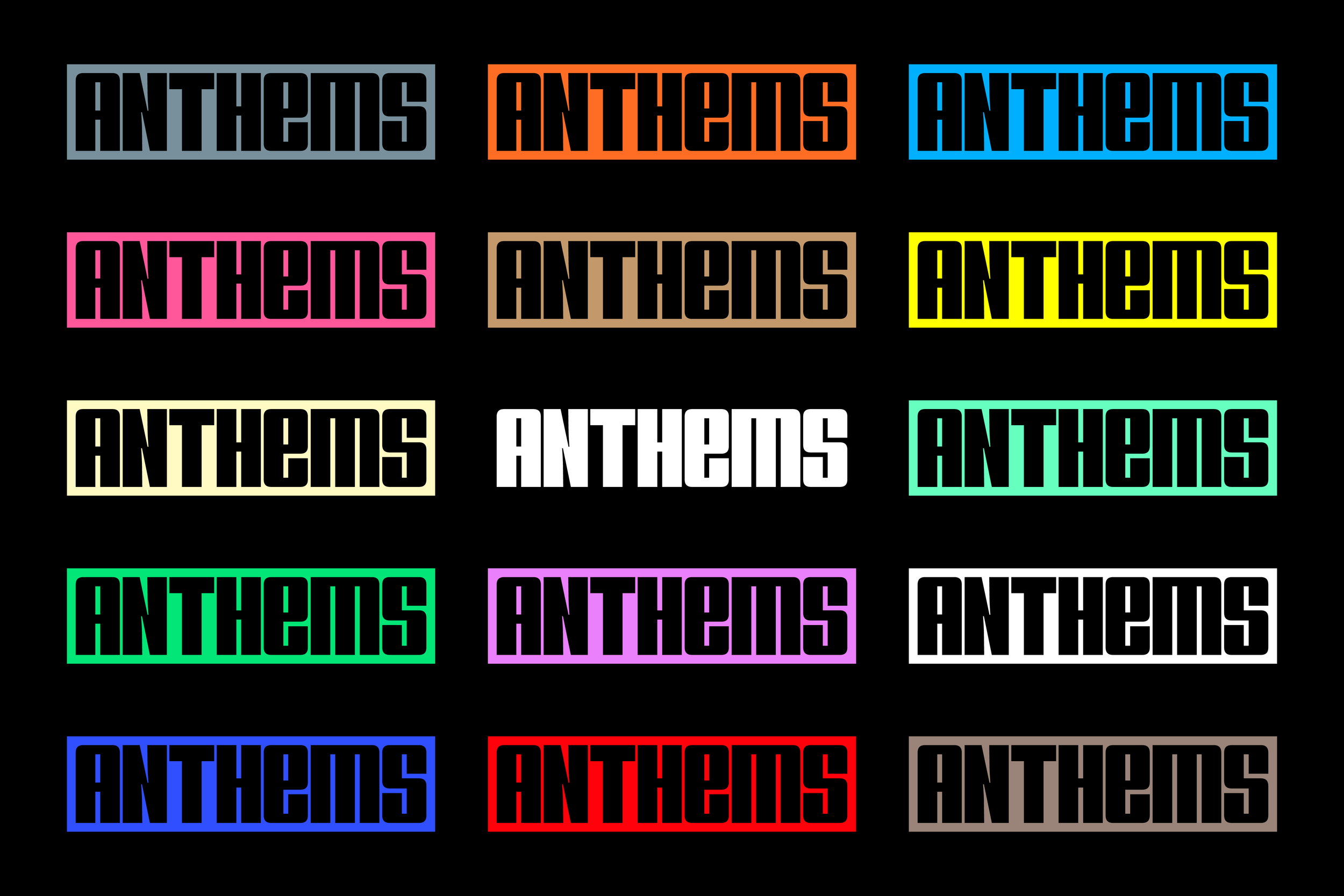
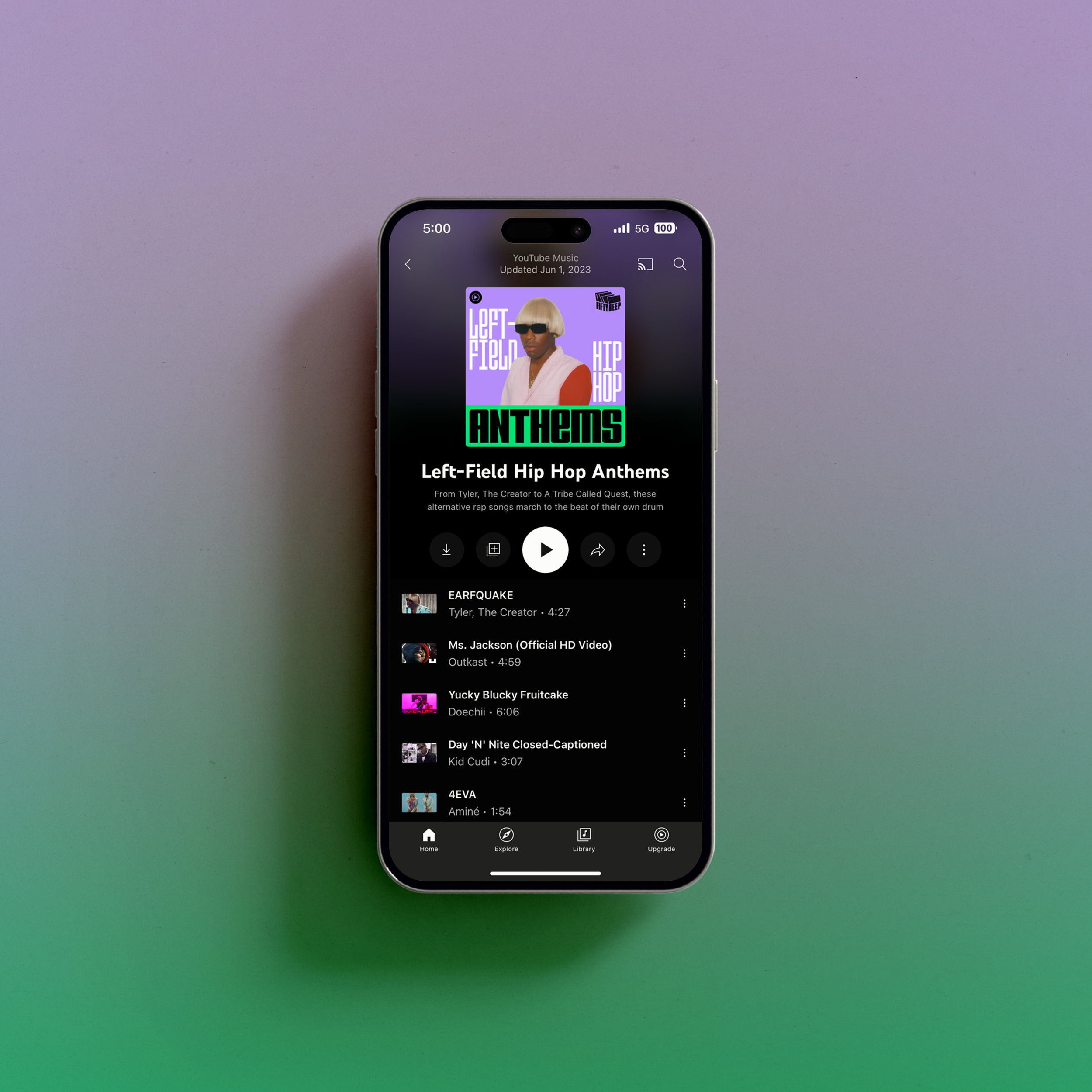
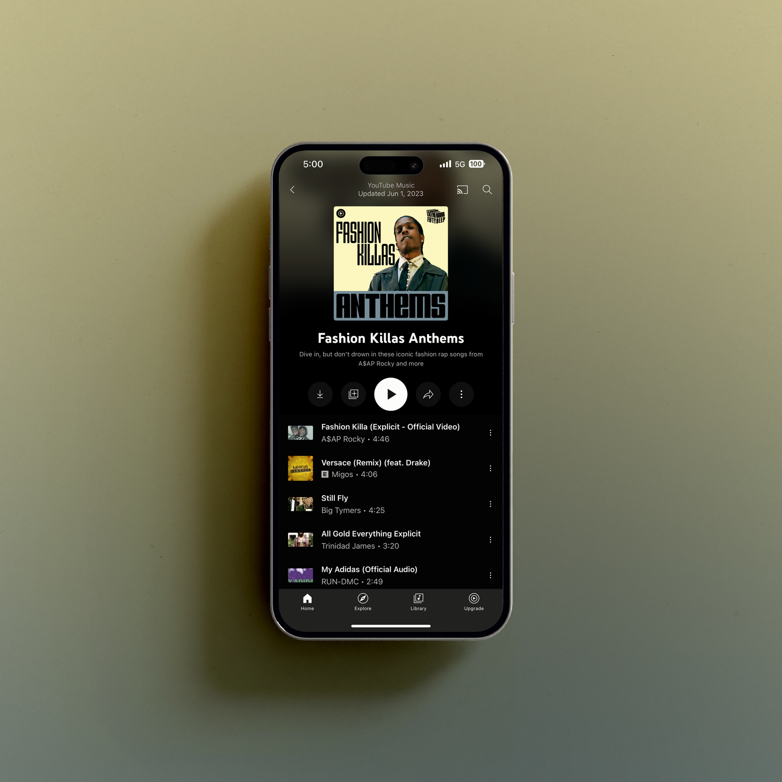
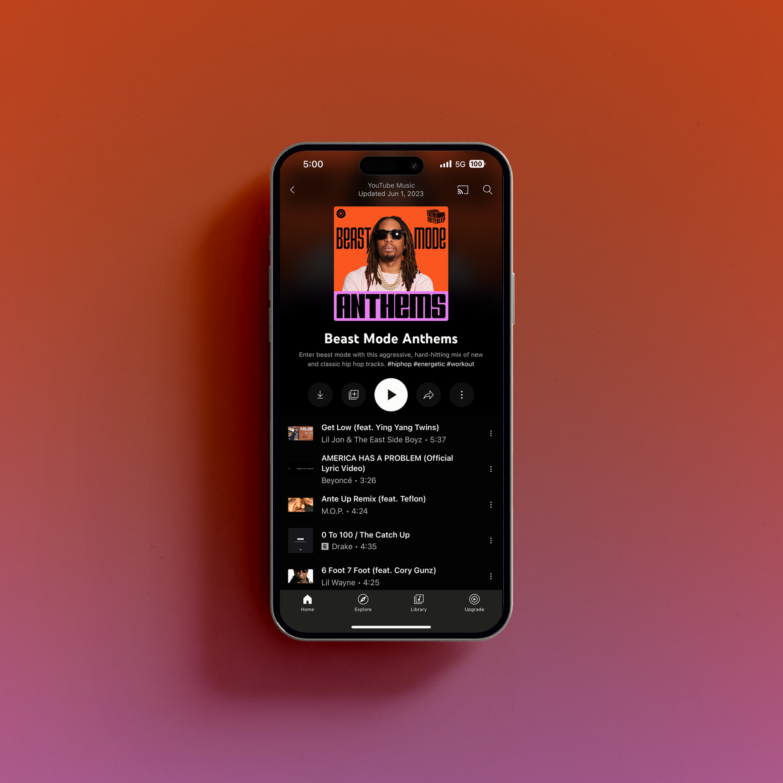
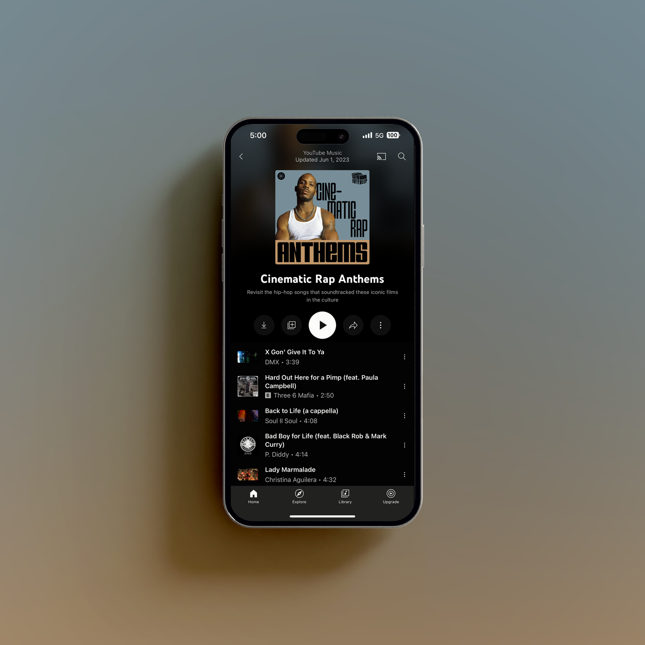
Based on this fact, I’ve taken the word “ANTHEMS” and made it the equivalent of the masthead, while the rest of the title acts as an intro to what’s inside of the magazine playlist. ¶ However, beyond the placement of the word “ANTHEMS,” I also took typographic cues from these magazines. As I began looking at these covers, I noticed that even in different countries (Radikal from France, for example), they all used squarish letterforms, similar to what you might find on gold nameplate jewelry. ¶ Lastly, I noticed that magazines such as Vibe, Blaze, and Ego-Trip used unicase (lowercase characters that are the same height as uppercase characters) ‘E’s. ¶ To emulate these typographic styles without tracing any of the logos, I used my previously released font family, VTC Spike. 
From here, the color palettes for each playlist cover were devised by taking cues from the names of the artists that grace them, from said artists' past album covers, as well as the names of the playlists themselves. ¶ Take "Street Code Anthems," for example. The color palette was derived from Ice Spice's name, thus resulting in a contrasting palette of warm and cool colors. On the opposite end of the spectrum is the playlist cover featuring Dr. Dre. The palette for this cover takes cues from the Doctor's past album covers. 


“I was captivated by Tré's type design work when I first came across Vocal Type. Since then, I have worked with him at different times at YouTube Music, but always with the consistent confidence he would provide graphic excellence and work with an easy process. Tré is able to propose new ideas, even with creative constraints. Thank you for everything!”
— Gabriela Namie, Art Director at YouTube Music


PARTNER(S):
Programming (Music curation): Tuma Basa, Melanie McClain
Artist Partnerships and Label Relations: Brittany Lewis and Ryan Thornton
Art Direction: Gabriela Namie
UX Design: Will Koehler, Daniel Walsh
Production Design: Genna Abramenko
50 Deep Logo Design: DL Warfield
Eng Team: Matt Montag, Nemanja Spasojevic
TIMELINE:
04.2023—06.2023
LAUNCH DATE:
06.2023
SERVICE(S):
Identity
Campaign
Typography
NOTE(S):
Design since modified by external team.