
March 10, 2022

The Stacey Abrams Campaign
Preface
Stacey Abrams is a four-time New York Times bestselling author, an entrepreneur, and a political leader. She is an award-winning producer and an Emmy Award nominee. ¶ A tax attorney by training, Abrams served eleven years in the Georgia House of Representatives, seven as Minority Leader, and became the 2018 Democratic nominee for governor of Georgia, where she won, at the time, more votes than any other Democrat in the state’s history. She has launched multiple organizations devoted to voting rights, training and hiring young people of color and tackling state, national, and international social issues. 
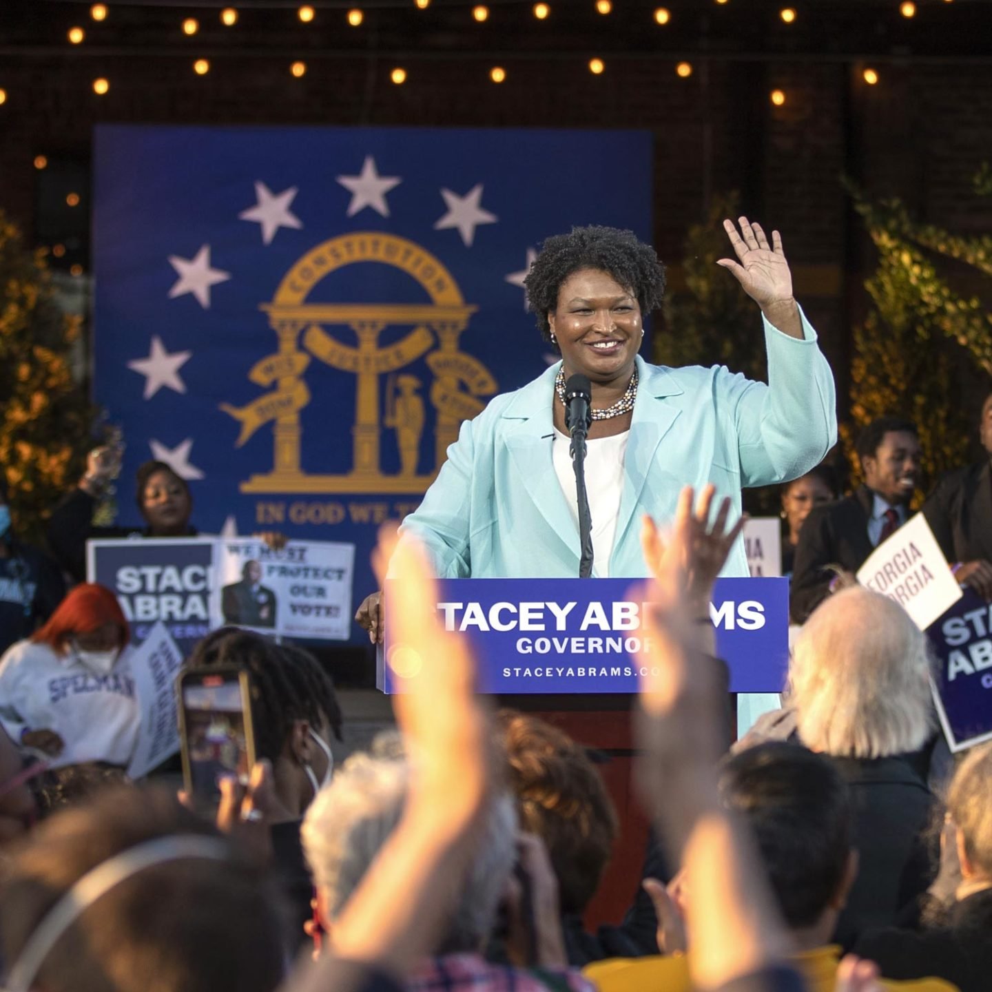
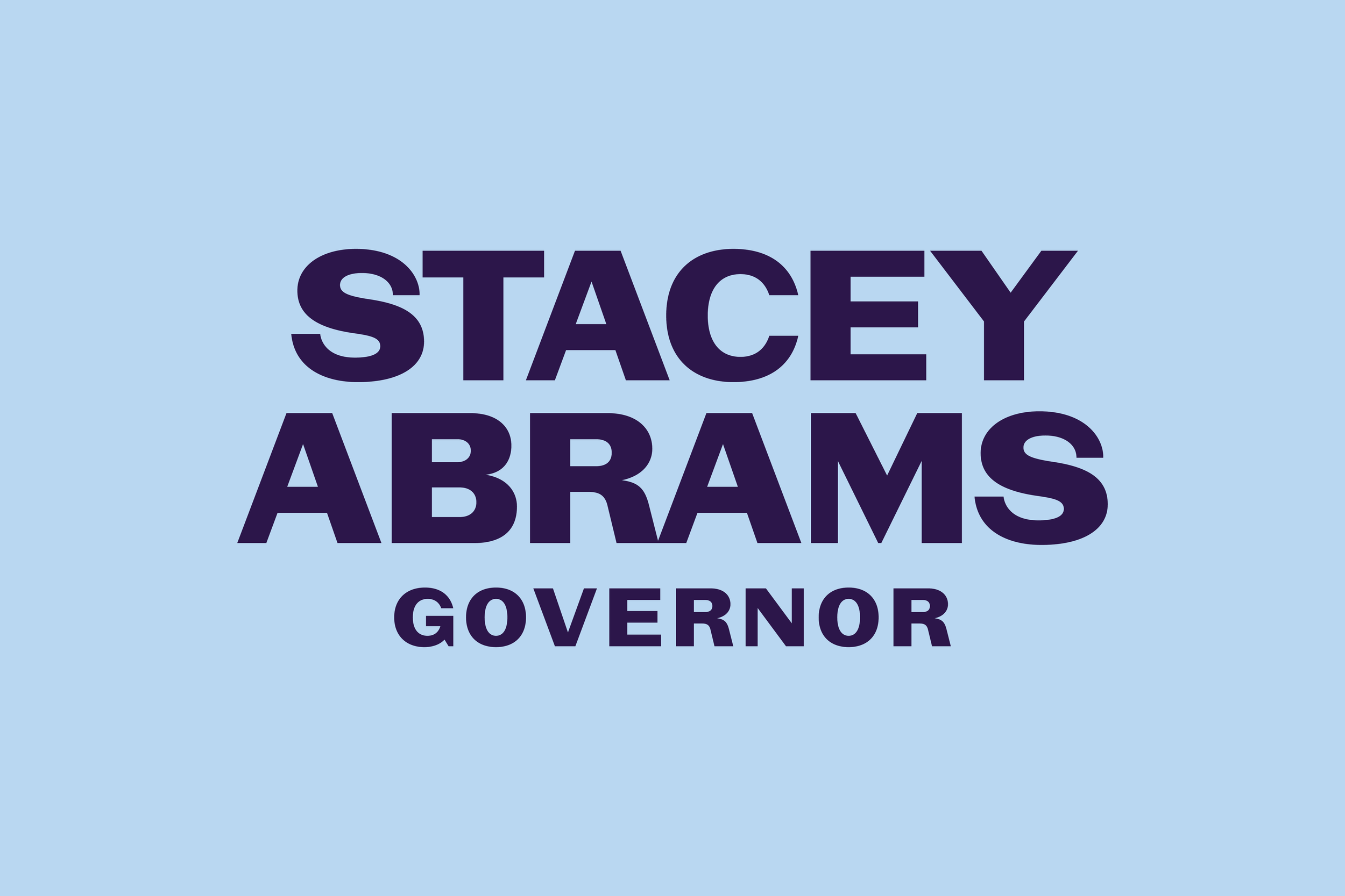
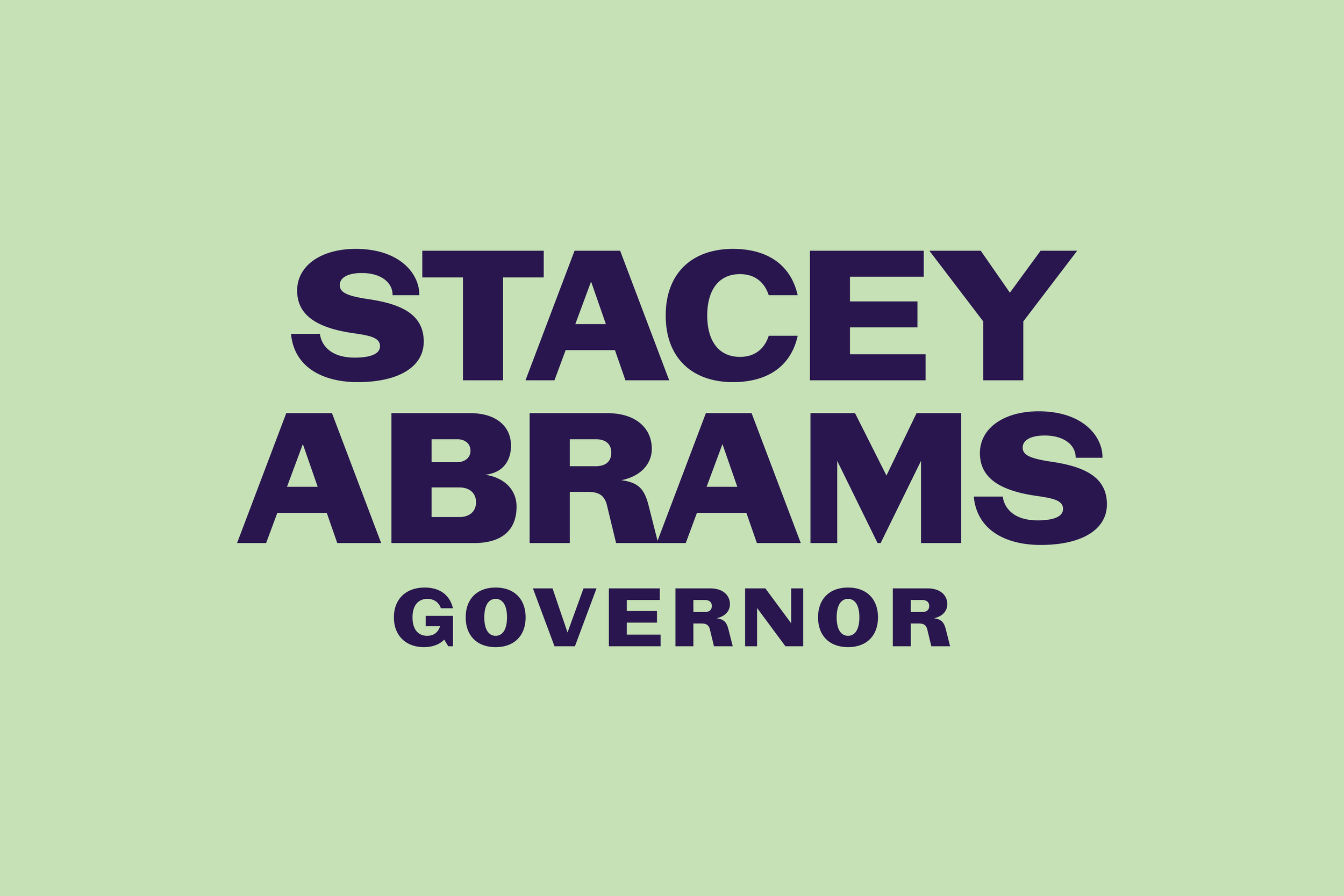
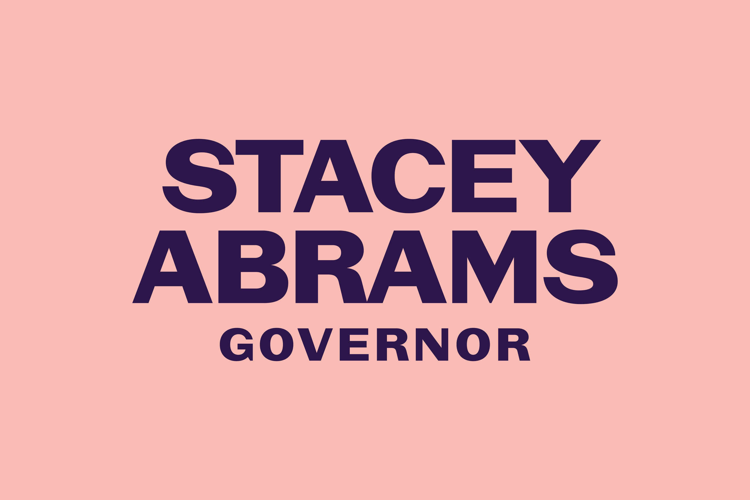
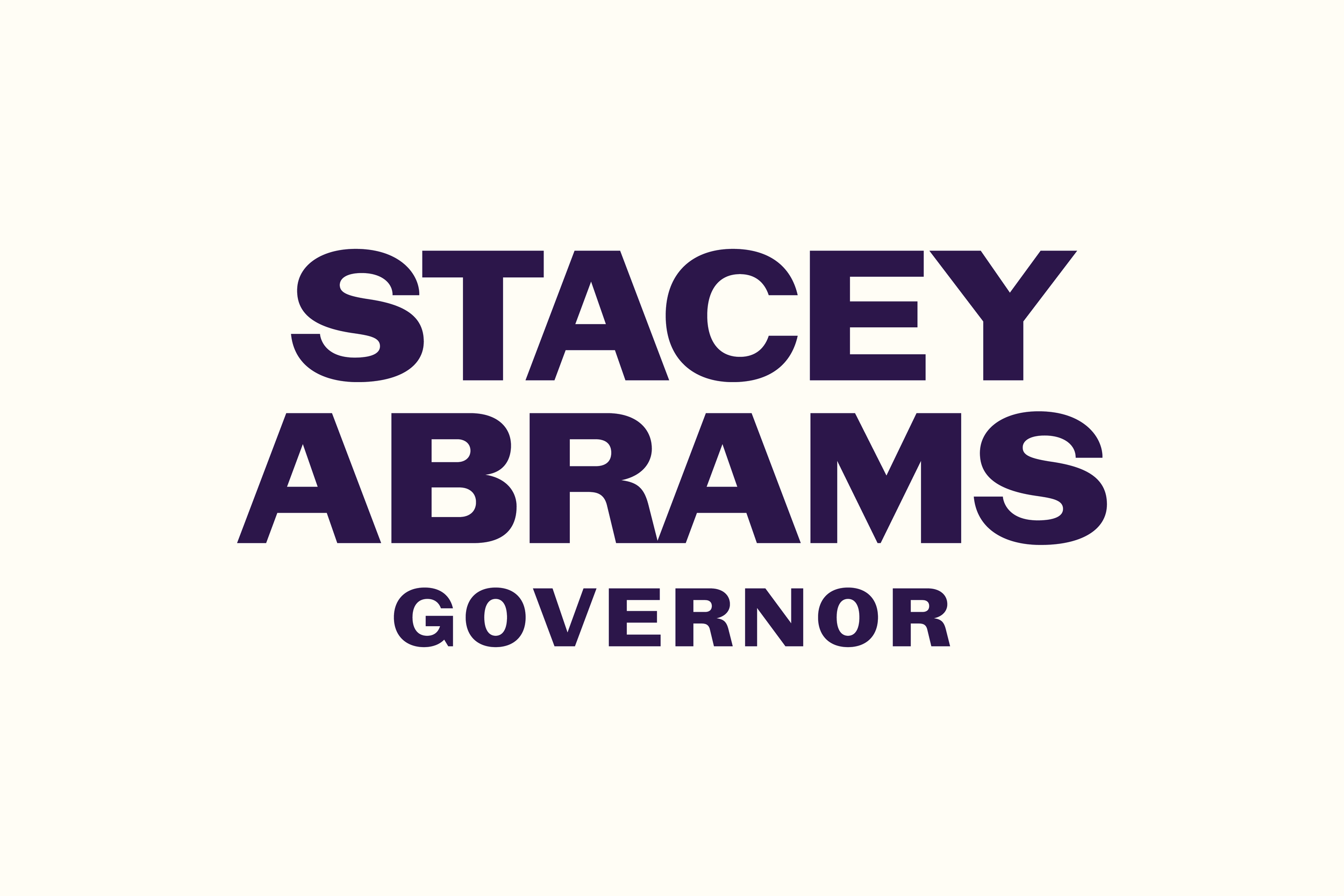
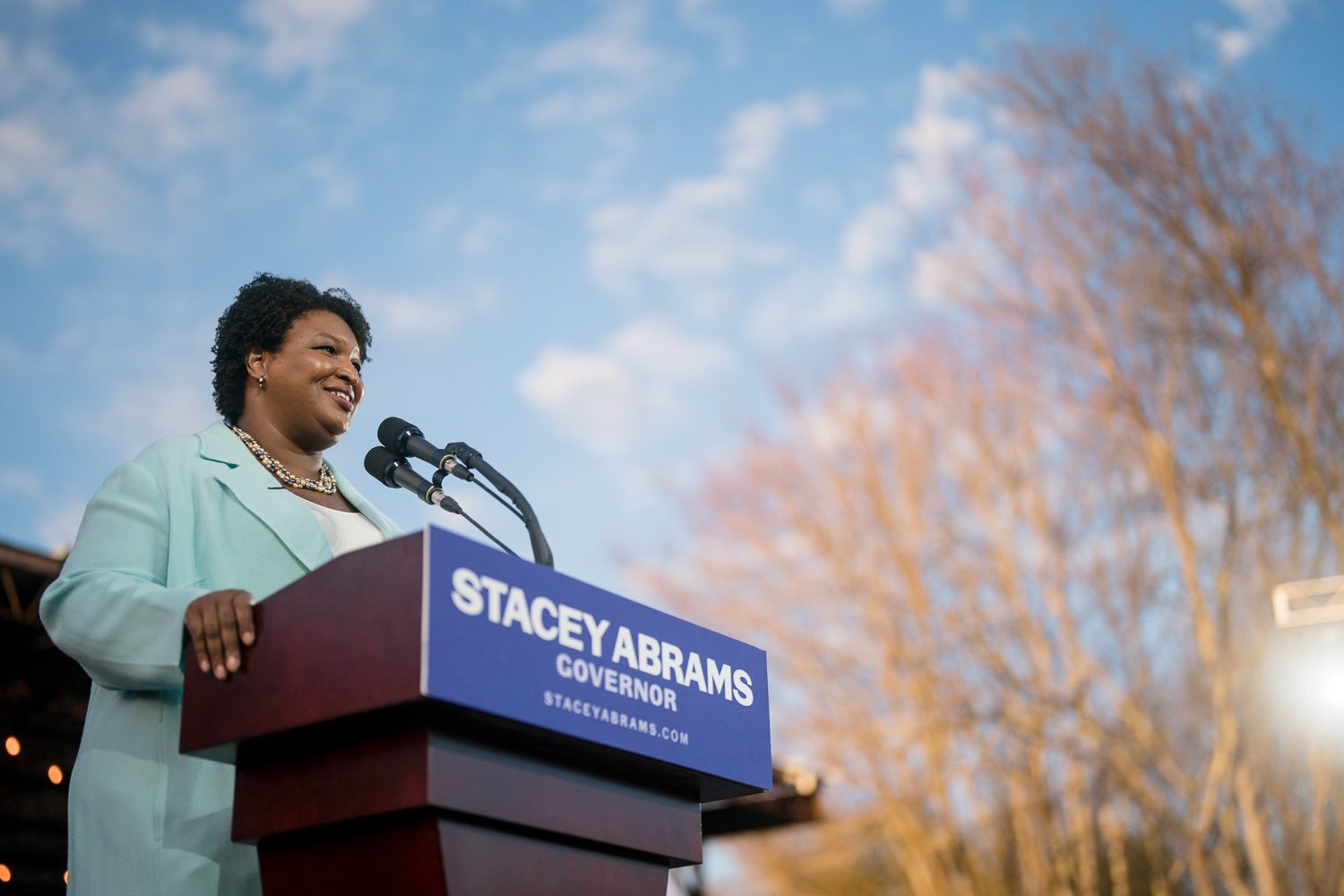
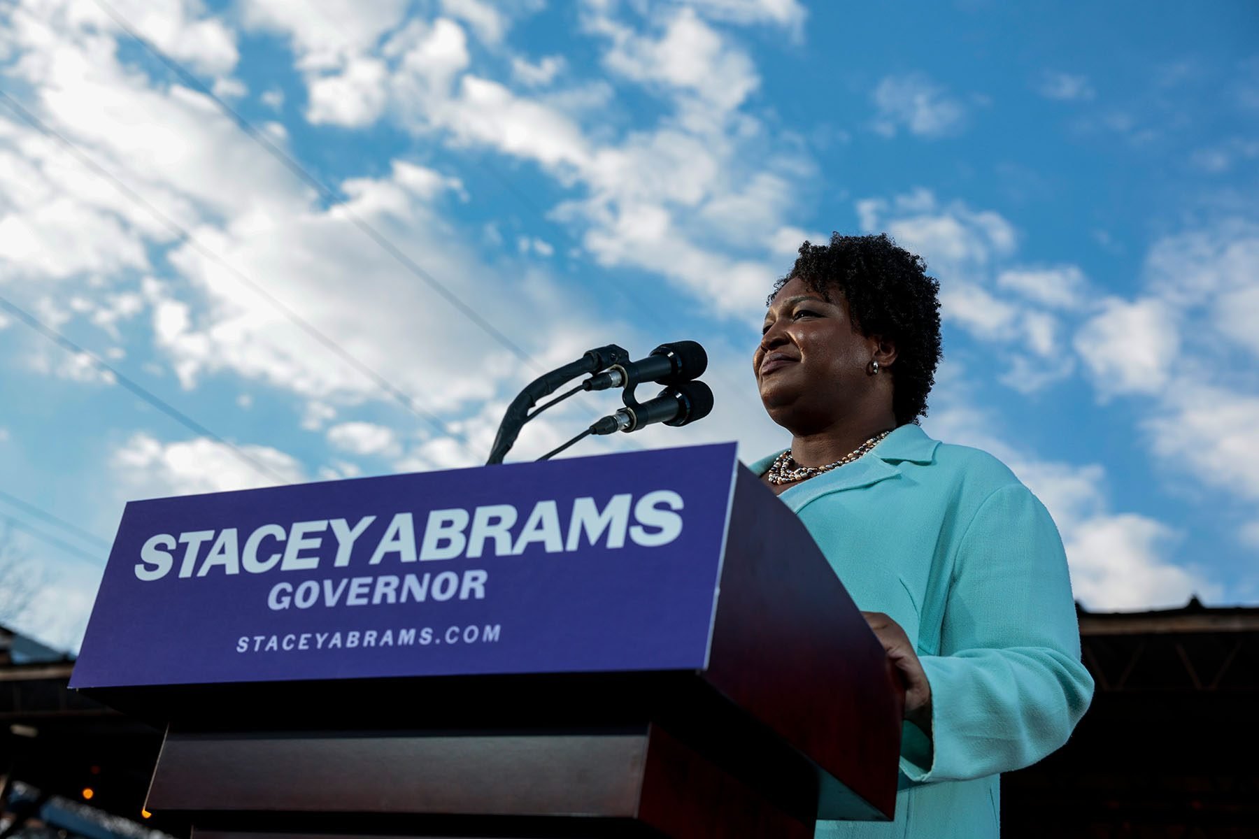
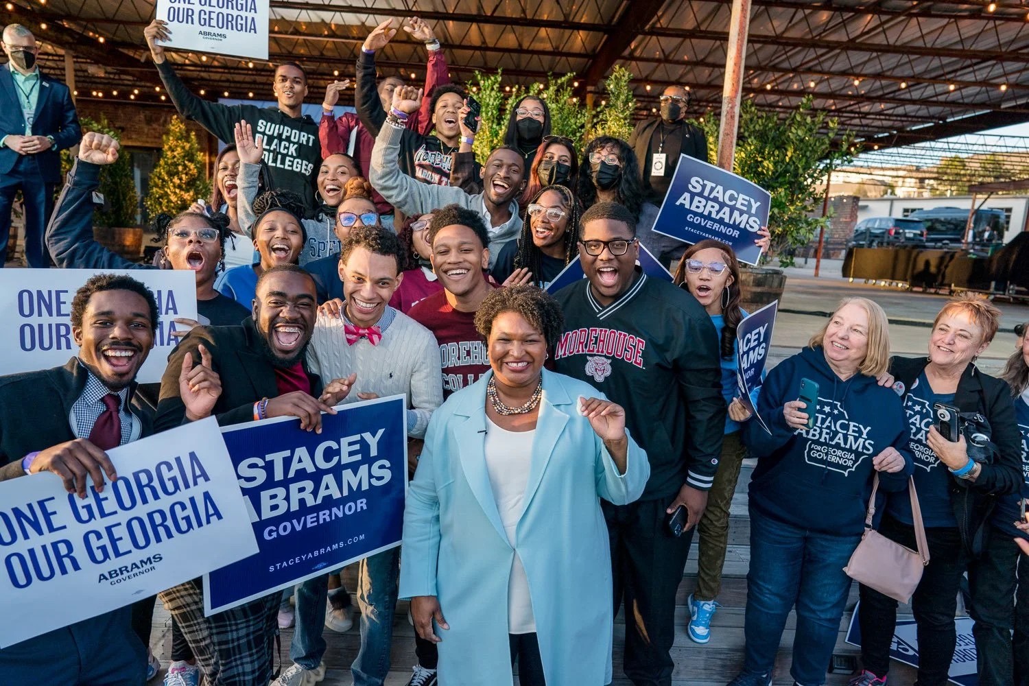
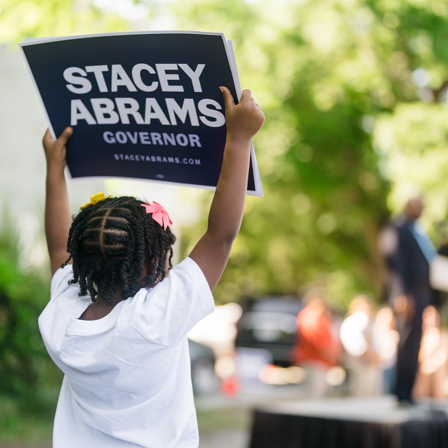
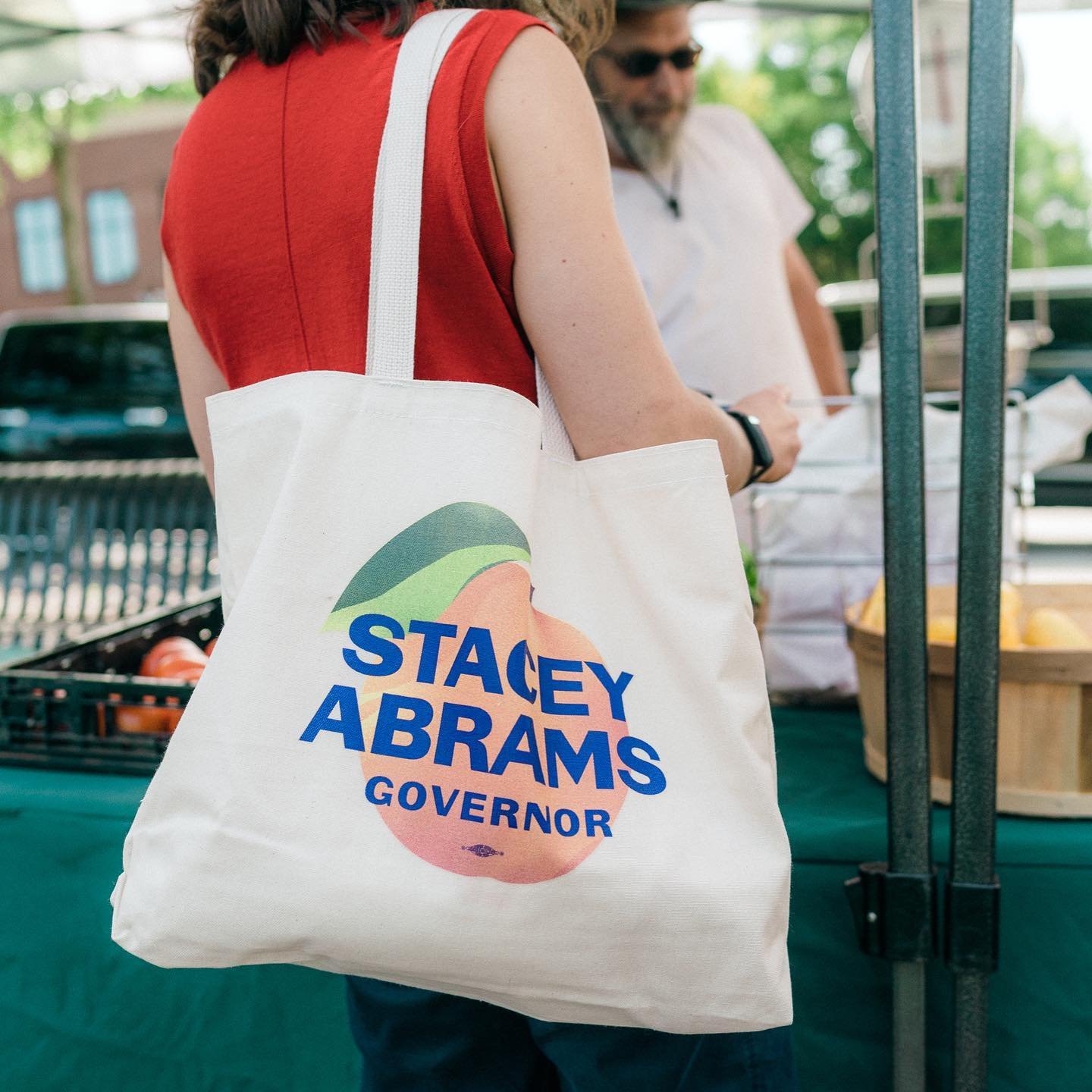
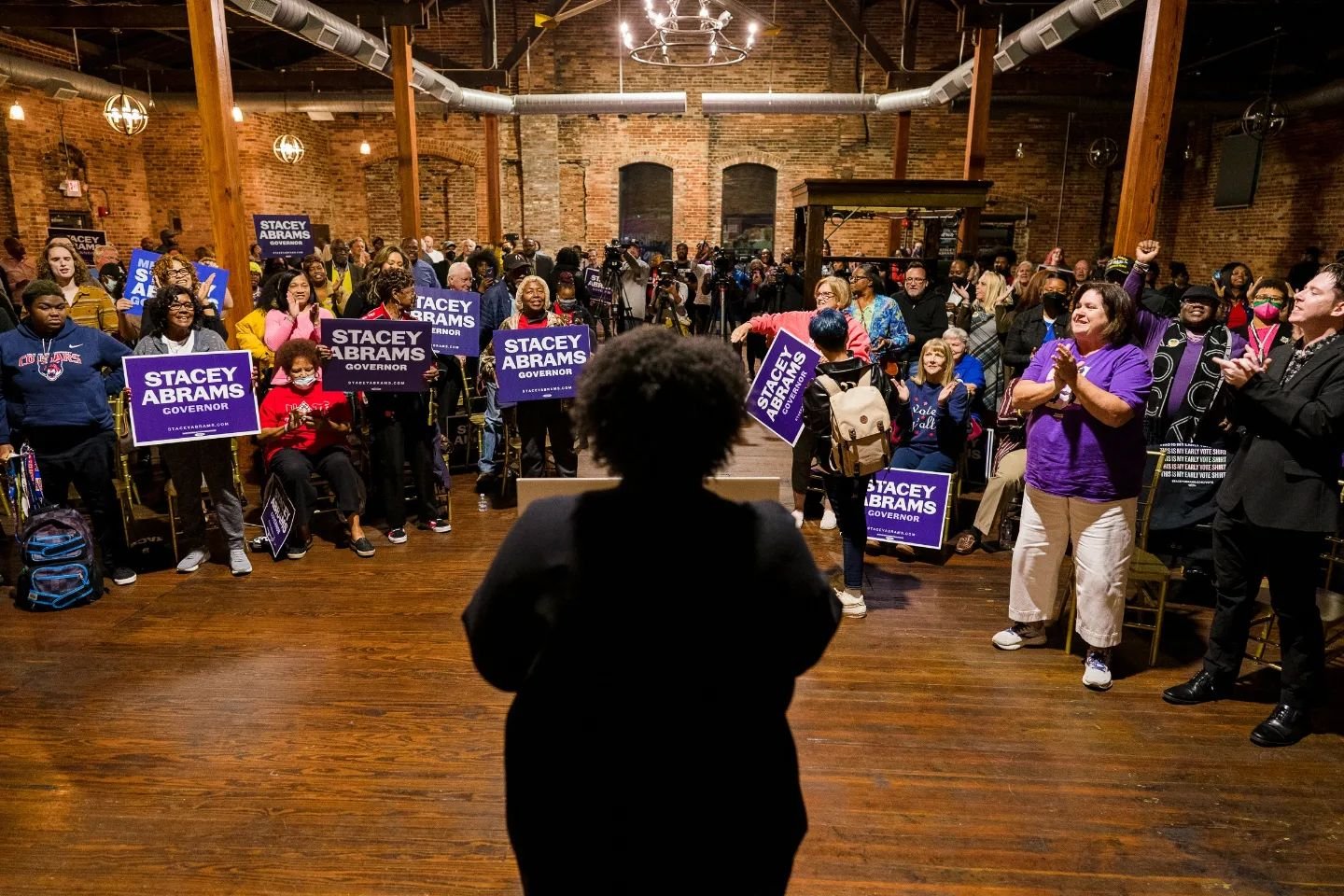
Abrams sits on both nonprofit and corporate boards and is a lifetime member of the Council on Foreign Relations. She has received degrees from Spelman College, the LBJ School of Public Affairs at the University of Texas, and Yale Law School. ¶ For her 2022 gubernatorial campaign, I had the opportunity to collaborate with the Washington, D.C.-based design studio, Wide Eye, on the brand identity. ¶ The result was a logo design featuring a custom version of Vocal Type's VTC Marsha. As you can tell from the photos, Stacey loved it. 
The Design
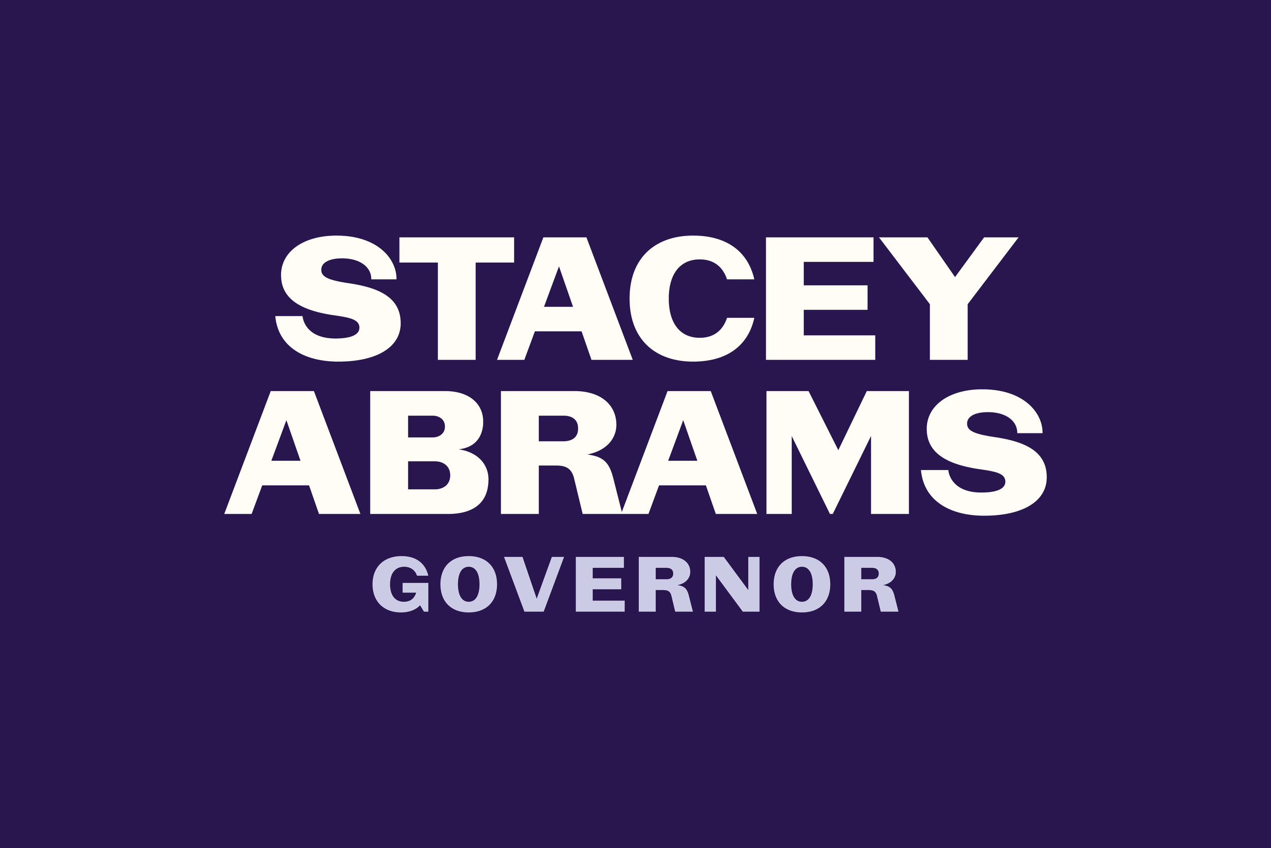
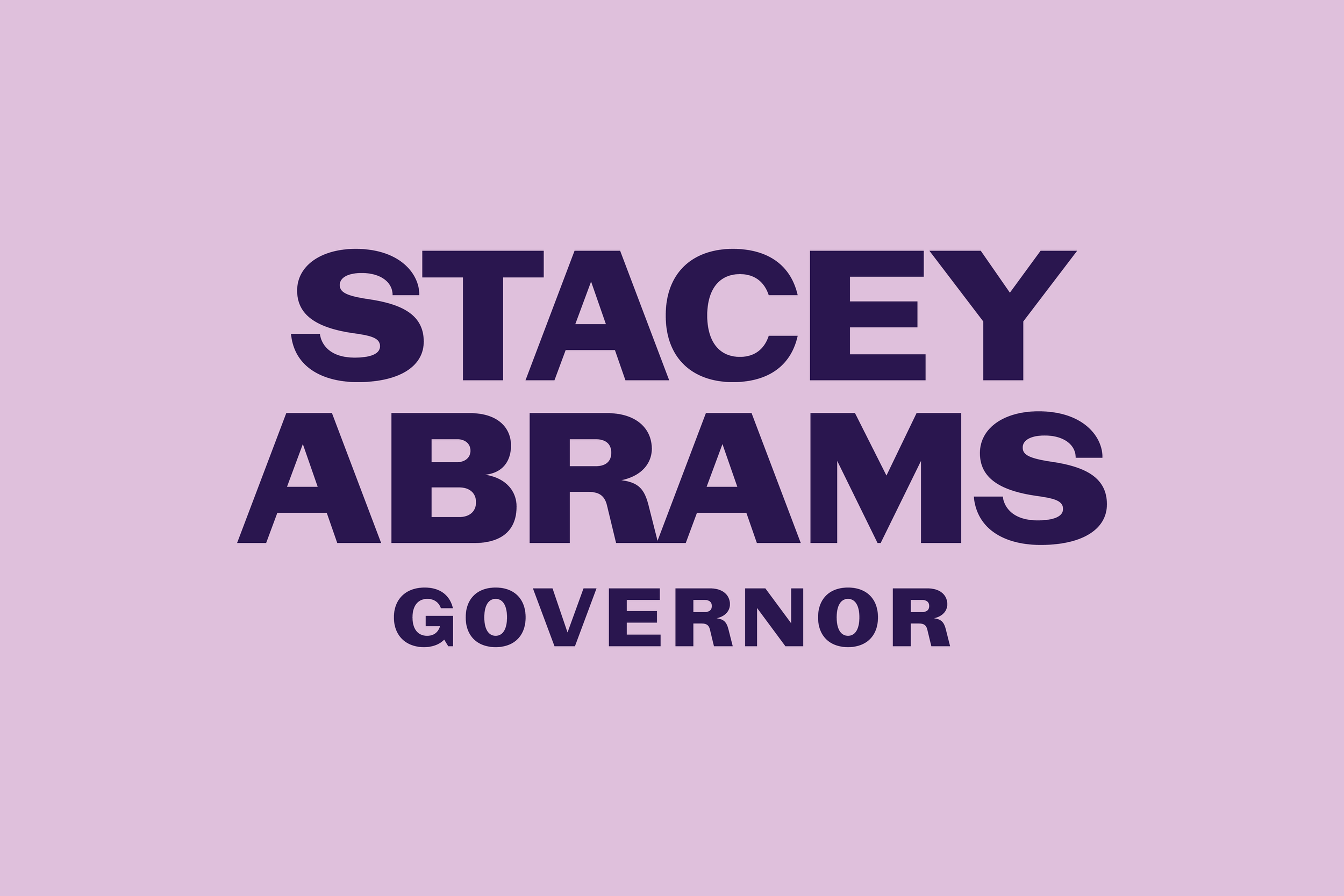
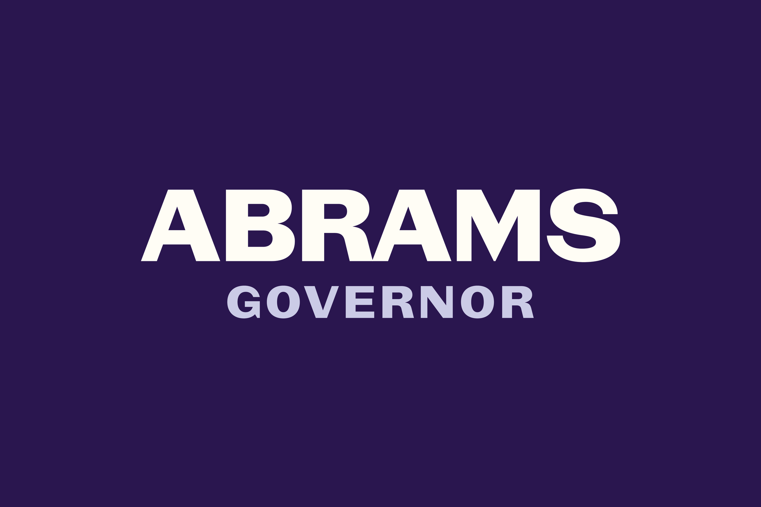
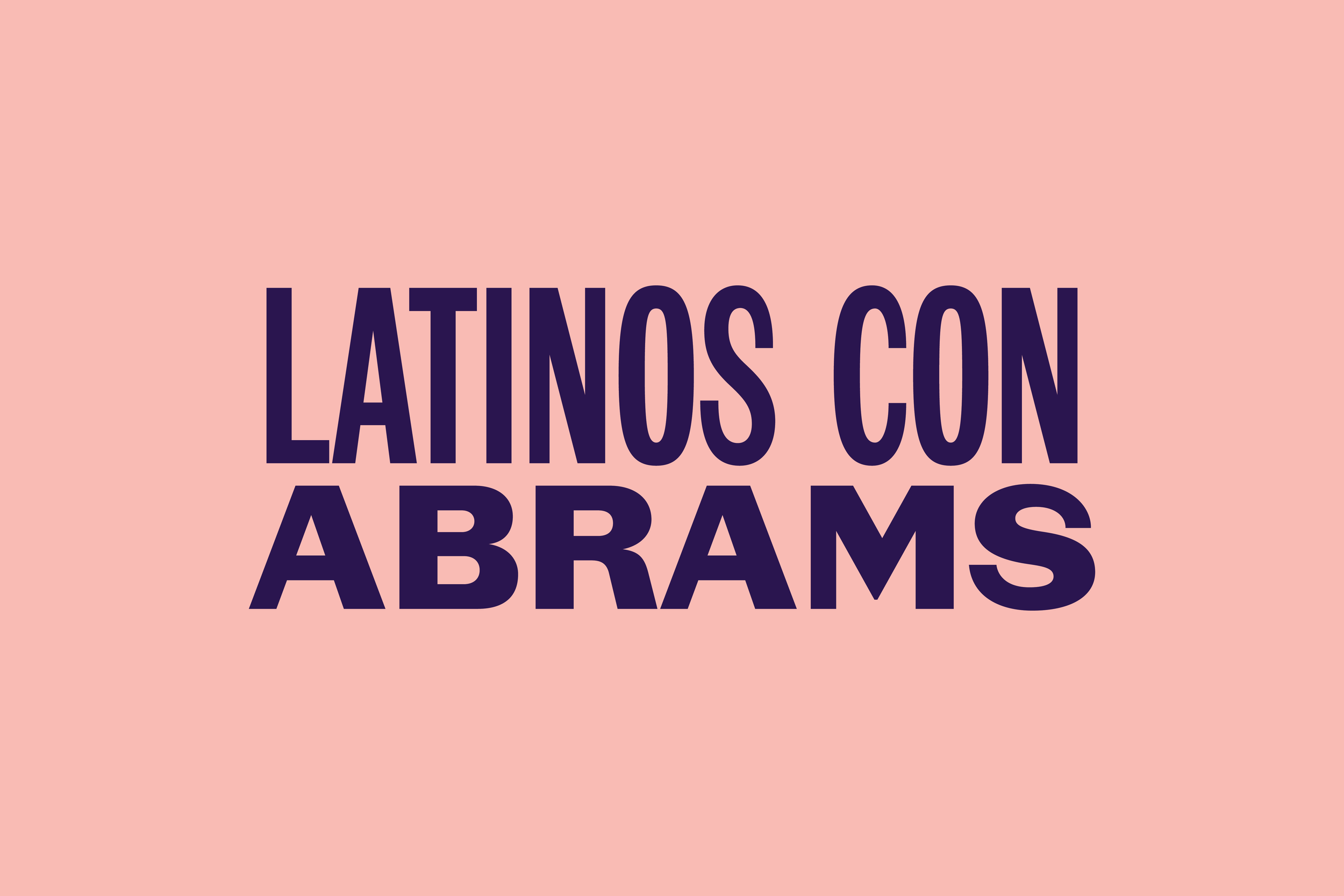
With only one week to design the brand identity, Ben Ostrower (founder of Wide Eye) and I were forced to make several quick decisions in crafting this logo design. ¶ As we live in an era where truth and words are under attack, our first decision was to only use words and the name "STACEY ABRAMS" in this brand identity. That meant no symbols and no flags, which automatically made her campaign stand out from the campaign designs of recent history. We wanted this identity to represent who she is and let her speak on everything else. 
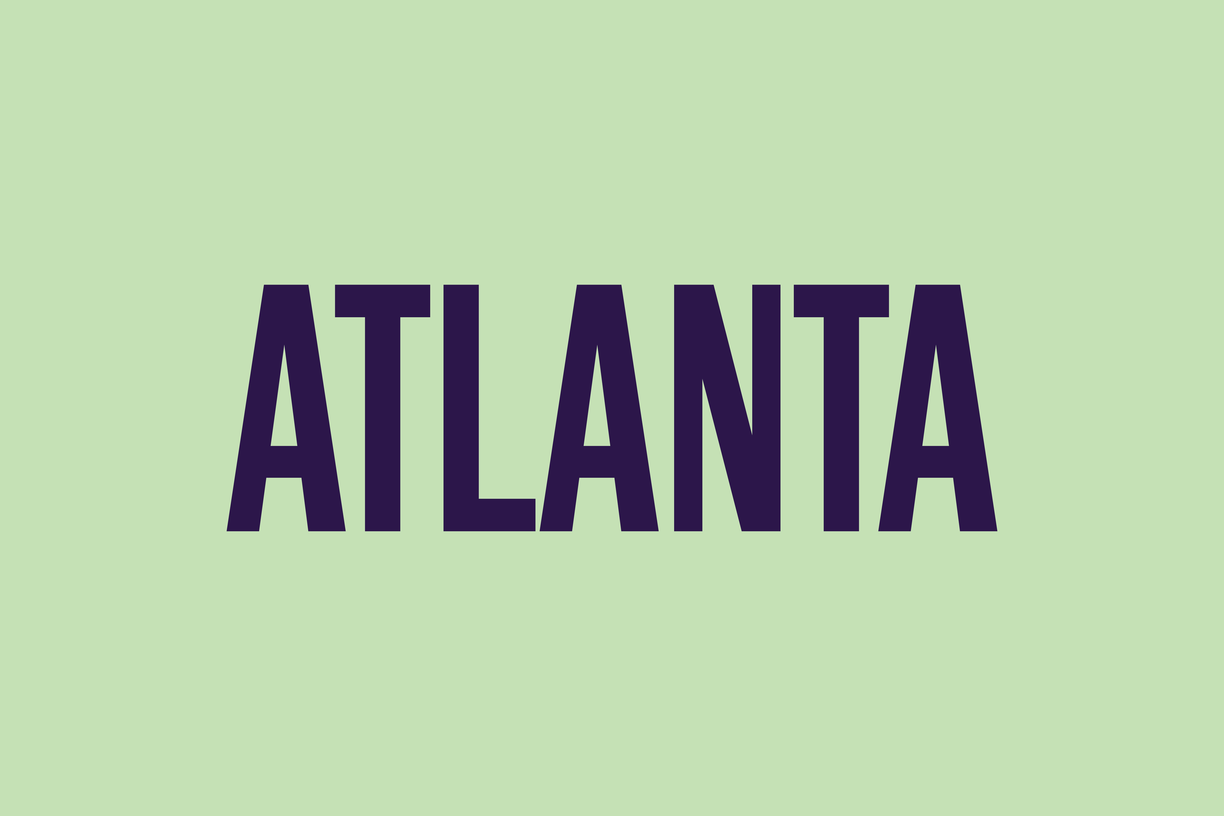
The logo design features a custom version of Vocal Type's VTC Marsha. Named after the LGBTQ+ rights activist, Marsha P. Johnson, and inspired by remnants of the Stonewall Inn (NYC). ¶ While Stacey does not identify as LGBTQ+, it was important that her logo offered just the right amount of personality, strength, sensitivity, and sophistication with a connection to Black history. 
Explorations
Beyond the logo, I worked with Ben on finding the perfect font family(s) to pair with the wordmark. It didn't take long for me to attempt to make several weights and widths based on VTC Marsha, now VTC Stacey. However, while the below iterations turned out well, we quickly realized that finishing all these styles would be impossible with only two weeks left. 
We ended up with what was, at the time, a work-in-progress font family from Frere-Jones Type, now called Community Gothic. While different, it looked pretty close to these expansions of VTC Marsha, and they paired nicely together. 

Since the Launch
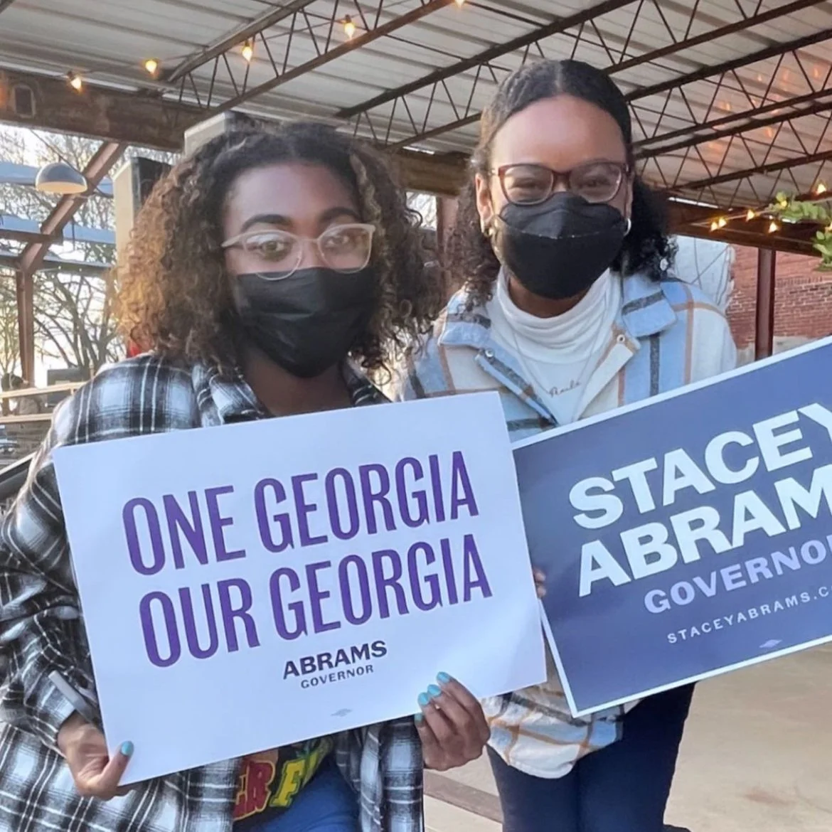
I honestly didn't know how to express my emotions when I first saw this logo design out in the world. Some celebrities were involved, like Lebron James and Kerri Washington, but that isn't what amazed me. I can only say that it was amazing to see so many people from many backgrounds connecting with something I've made. 
Images courtesy of Wide Eye and the Stacey Abrams Campaign
PARTNER(S):
Creative Director: Ben Ostrower
TIMELINE:
01.2022—02.2022
LAUNCH DATE:
03.2022
SERVICE(S):
Identity
Typography

NOTE(S):
N/A